


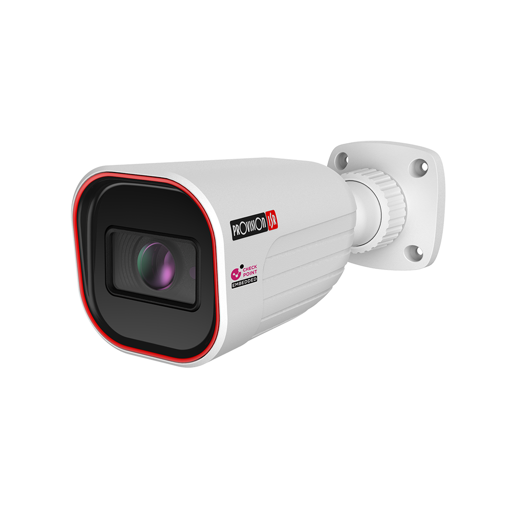
כמובן, נשמע כאילו יש צורך לארגן ולפשט את שם המוצר תוך כדי שמירה על המפרט הטכני החשוב שמבדיל אותו ממוצרים אחרים. הנה הצעה לניסוח מחודש וברור יותר: מצלמת רשת PROVISION nan I4-320IPEN-MVF – עדשה חשמלית מתכווננת, IP67 בניסוח זה, הסימון "nan" והדגם "I4-320IPEN-MVF" נשארים כחלק מהשם לשם זיהוי מדויק של המצלמה, אך המידע על העדשה וההגנה ממים מסודר באופן שמדגיש את היתרונות העיקריים של המוצר בצורה ברורה וקולחת יותר.
805.94 ₪
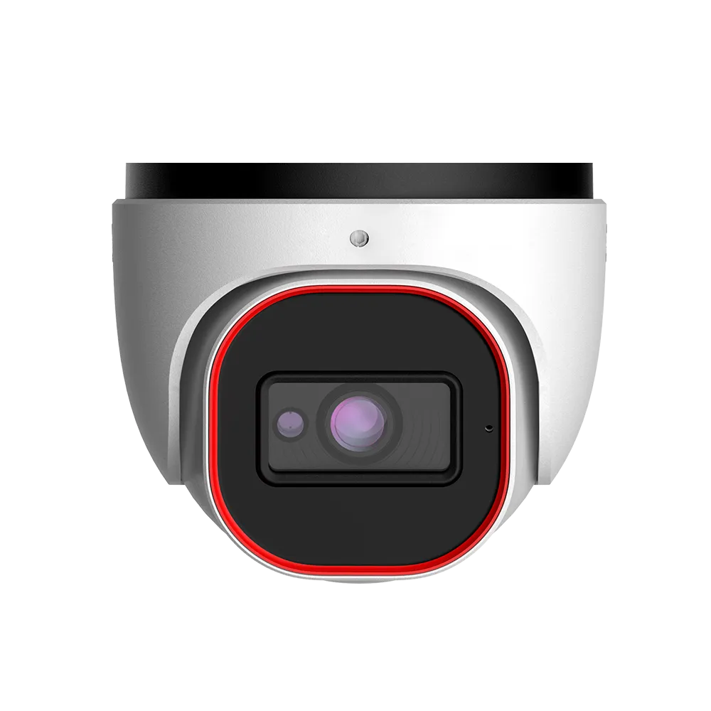
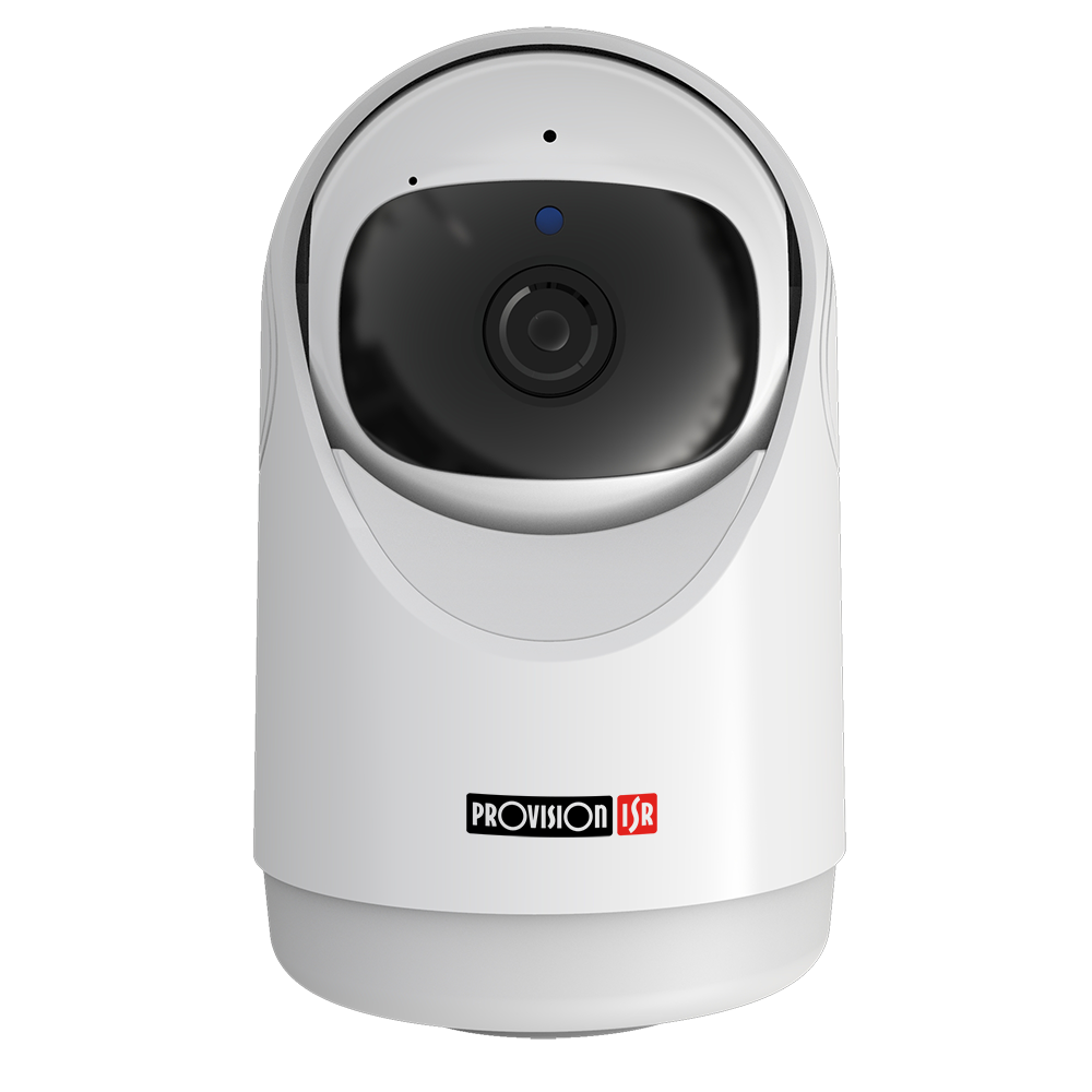
מוצר: מצלמת רשת PROVISION דגם DAI-380IPSN-28-V2 עם עדשה קבועה, עמידה בתקן IP67
965.24 ₪
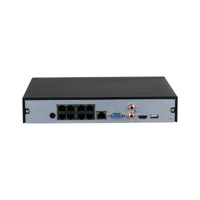
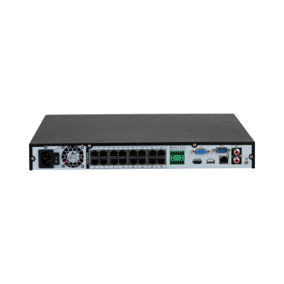
מערכת ההקלטה Dahua NVR4108HS-8P-4KS2/L POE: יחידת אבטחה דיגיטלית ל-8 ערוצים עם דיסק קשיח בנפח 1TB
המחיר המקורי היה: 1,660.00 ₪.1,200.00 ₪המחיר הנוכחי הוא: 1,200.00 ₪.